

2024
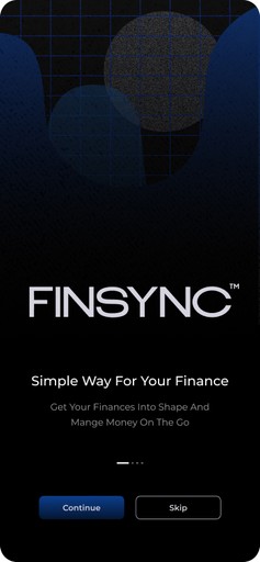
FIN SYNC
Finsync is a financial management app concept designed to simplify and streamline the way users track their expenses, manage budgets, and handle investments, all in one place.
Project Brief
In my fall semester Product Design course, I was challenged to create a digital product to solve a real-world industry gap. New to fintech, I aimed to address the struggles people face in managing multiple accounts, bills, and expenses.
Project Details
Concept project
Data visualization
Data analytics
My Role
Product designer
Prototyping
User testing
Context
FinTech
Aug - Nov 2024
Coursework
Fragmented Tracking
Users find it hard to get a clear view of their finances because they have to use separate apps for banking, budgeting, and investments.
Tedious Splitting
Splitting expenses with friends or roommates is manual, time-consuming, and requires multiple apps, often causing errors or friction.
Limited Insights
Existing financial apps lack personalized insights, making it difficult for users to discover better financial strategies and make informed decisions about their money.
Time Inefficiency
People spend an average of 4 hours per week managing finances across multiple apps, totaling over 200 hours a year.
~ Plaids Fintech Report
Multiple Apps
43% of finance app users find managing finances time-consuming and complicated due to using 3-4 apps.
~ Aite-Novarica Group
Defining the Problem Statement
How might we help users effortlessly manage all their finances in one centralized platform?
User Interview
I conducted in-person interviews with 12 participants with diverse backgrounds.
University Students
Age 18-35
Business Owners
Age 45-60
Seasoned Professionals
Age 65-75
This process yielded a wealth of qualitative and quantitative insights that validated my problem statement.
With a solid foundation, I conducted a competitive analysis to identify existing solutions and understand their strengths and weaknesses. I also created personas based on the interviews to gain a deeper understanding of the target users.
Insights
Persona 1
Persona 2
Competitive Analysis
Quantitative
72% of users switch between 3-5 apps to manage their finances.
58% say splitting shared expenses with friends is often inaccurate or tedious.
68% of users lack clear insights into their monthly spending patterns.
Qualitative
Missed Payments
Lack of Support for Financial Literacy
Overwhelming Investment Choices
"I often miss payments because I forget which account has auto-pay enabled."
Why "Finsync"?
The name Finsync combines “Finance” and “Sync”, symbolizing the platform’s core value—synchronizing all financial activities into one seamless experience.


Upcoming events
Paris blog
Support the cause


Slow flow
Online courses
Wellness retreats


News article
Buy my prints
Travel vlog


Latest single
Bubble Gum Music Video
Listen on Spotify

Landing page - Mobile

Landing page - desktop

All transactions
Total balance
Card information
Learning resources

Feedback From Professor and Peers
I refined the initial design based on feedback, identifying key improvements and prioritizing features to better meet user needs. Here are some iterations driven by that feedback:
Feedback 1: Multiple Card Support


A key limitation in the initial design, which only supported connecting a single card.
To enhance usability and coverage, I modified the design to support multiple card connections.
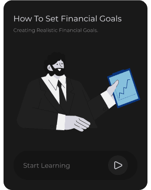
Feedback 2: Improve Learn Discoverability


The Learn function being tucked away in the Help section made it less discoverable and underutilized. To increase visibility and accessibility, I expanded the Learn function into a standalone page
Reframing The Problem Statement
I initially designed Finsync as a web-responsive platform, but feedback emphasized the need for better privacy and on-the-go convenience. As a result, I transitioned it into both a desktop and mobile application.
User Testing Insight 1: Limited Filtering Options
Participants found the date-only filter too limiting when analyzing their financial data. To enhance usability and flexibility, I expanded the filtering options in the hi-fidelity iteration, allowing users to filter by categories, transaction type, and amount in addition to date.


User Testing Insight 2: Improving Stock Access
User feedback highlighted frustration with repeatedly searching for frequently tracked stocks. To address this, I added a section for "Pinned Stocks" for quick access to favorites.


Wallet
Adressing frustration with managing multiple accounts, reporting they check several apps for balances and transactions.

Learn
Users lacked financial literacy, making informed decisions difficult. They expressed a desire for in-app educational content.


Stocks
User interviews revealed frustration with switching apps for stocks, while 72% of users preferred tracking investments and expenses together.

Split
User interviews revealed that manually splitting expenses with friends often caused confusion and delayed settlements.


Multiple Cards
Dashbaord
Learning Resources


Lato
Roboto
Font Family
#191919
1 2 3 4 5 6 7 8
#2B2B2B
@ $ % & *
#19499C
Aa
#0B0B0B
#191919
H1
18px
Lato - Bold
H2
16px
Lato - Regular
H3
14px
Lato - Regular
Button
14px
Lato - Semibold
Data heading
14px
Roboto - Semibold
Data
14px
Roboto - Regular
Data
14px
Roboto - Regular
#C2C2C2
Learnings
Through this project, I gained valuable insights into user-centered design, iterative refinement, and the importance of aligning with real user needs.
User-Centric Design:
Conducting user interviews and usability testing reinforced the value of gathering qualitative and quantitative insights early on.
I learned how to translate pain points into practical design solutions, such as introducing Splits and Pinned Stocks based on direct feedback.
Iterative Refinement:
The project highlighted the importance of pivoting based on feedback.
For instance, shifting from a web-responsive design to a native app significantly enhanced the user experience by prioritizing accessibility and convenience.
Data-Driven Decision-Making:
By conducting competitive analysis, I understood how to differentiate Finsync by incorporating features like multi-card control and personalized financial insights.
This helped me balance user needs with industry trends, creating a solution that felt both familiar and innovative.